The problem
Most people are bad at gift-giving, and not because they don't care. Birthdays, anniversaries, weddings, baby showers, and holidays arrive on a predictable schedule, but the work of remembering what to get each person, what they already got from you, and how much you've spent gets spread across a calendar app, a notes app, and your own memory. No single missed birthday is a disaster. The cost just builds up across the people in your life, year after year, and nobody quite gets around to fixing it.
The people who feel this most are already trying to solve it on their own. They keep spreadsheets of who got what last Christmas, scribble names and budgets into the Notes app after birthday parties, and set calendar reminders that fire the day of, leaving no time to actually pick up a gift or plan anything. They aren't looking for a new category of app. They're looking for one place to put what they're already doing across three or four.
None of these tools really fixes the problem. Calendars know the dates. Budget apps track the spending. Notes holds whatever you scribbled at the party but won't surface it when you actually need it. Gift-tracker apps mostly do wishlists. Each tool covers a slice and leaves you to stitch the slices together yourself, which is the part that's actually hard.
Return the Favor was built on a different bet: one workspace where people, dates, gifts, and budgets connect to each other instead of sitting in separate apps. A better calendar or a better notes app wouldn't help. The problem doesn't live in any single tool. It lives in the gaps between them. The product's job is to take administrative work away from the user.
Initial vision and early build
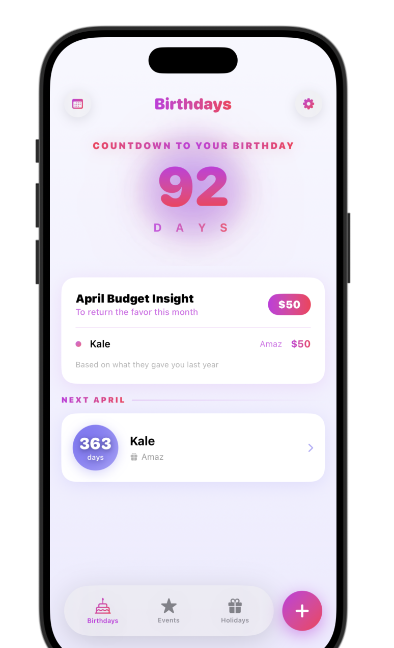
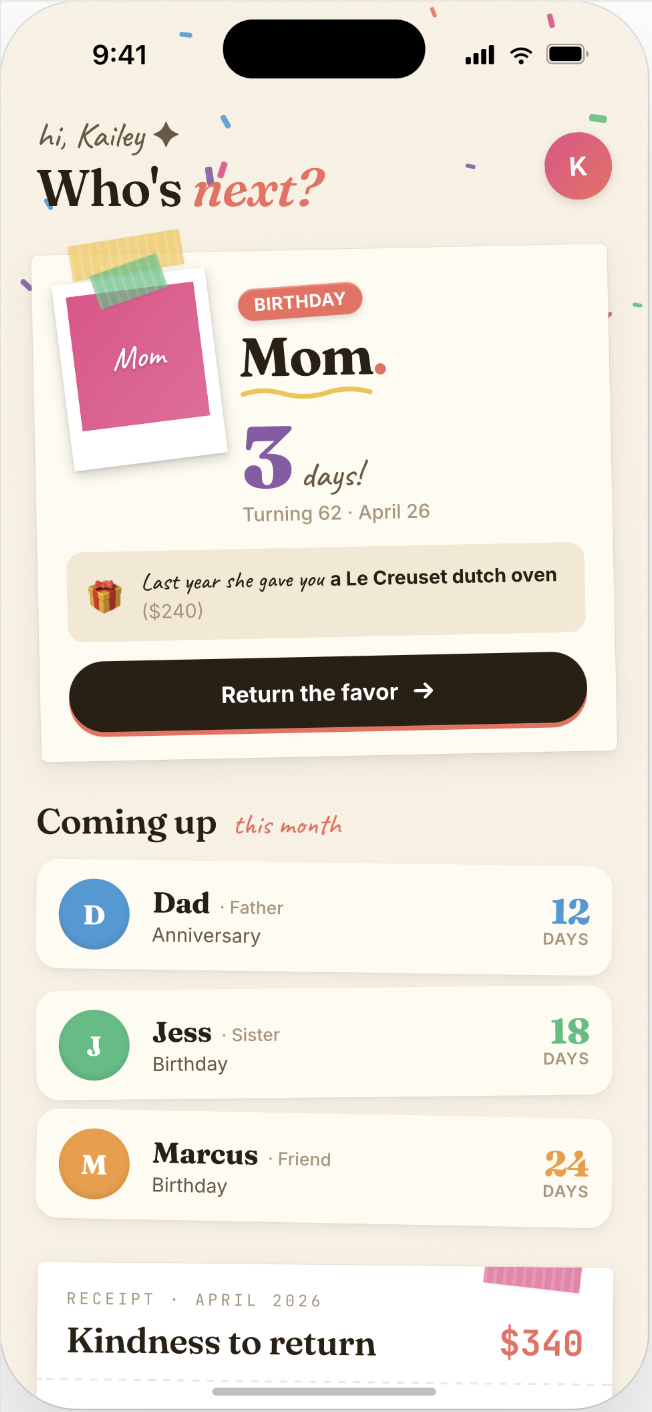
The original v1 spec was small on purpose. Three tabs (Birthdays, Events, Holidays), each opening with a countdown to whatever was coming up next. Budget tracking was a single dollar value attached to each gift. I wanted the product to feel like a focused utility you could open, find an answer in, and close again.
The spec didn't survive the first week intact. The biggest change came from a question my wife asked me on day five of the build:
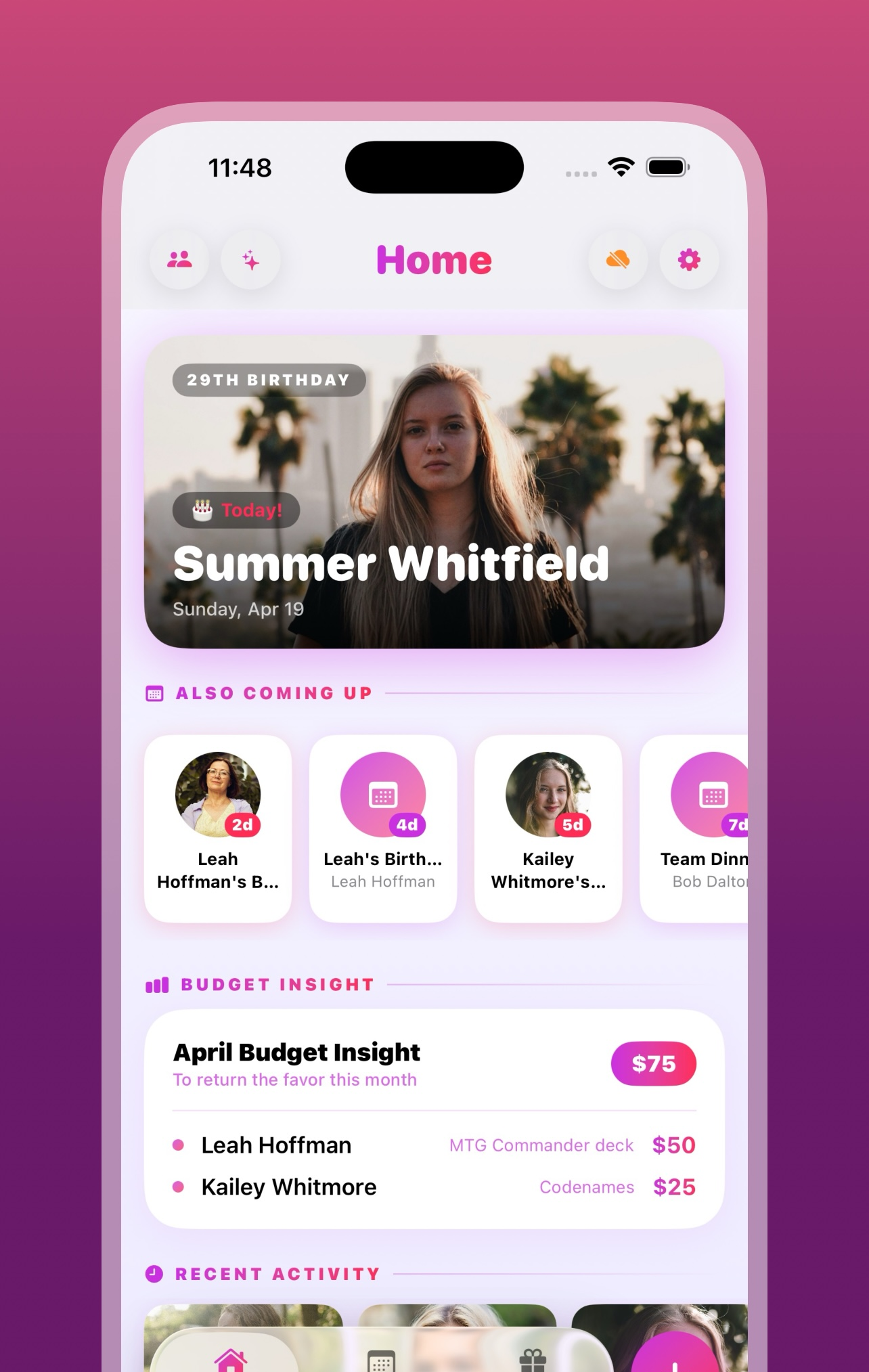
The original navigation assumed users would move between the three tabs based on what they were trying to remember. She didn't think that way. She wanted one screen that showed her what was coming up next, what she'd already spent that month, and which people the app actually knew about, without having to pick a tab first. The Home tab was built that night. To keep the navigation at three tabs, Birthdays got folded into Events. That single question reset the structure of the whole app.
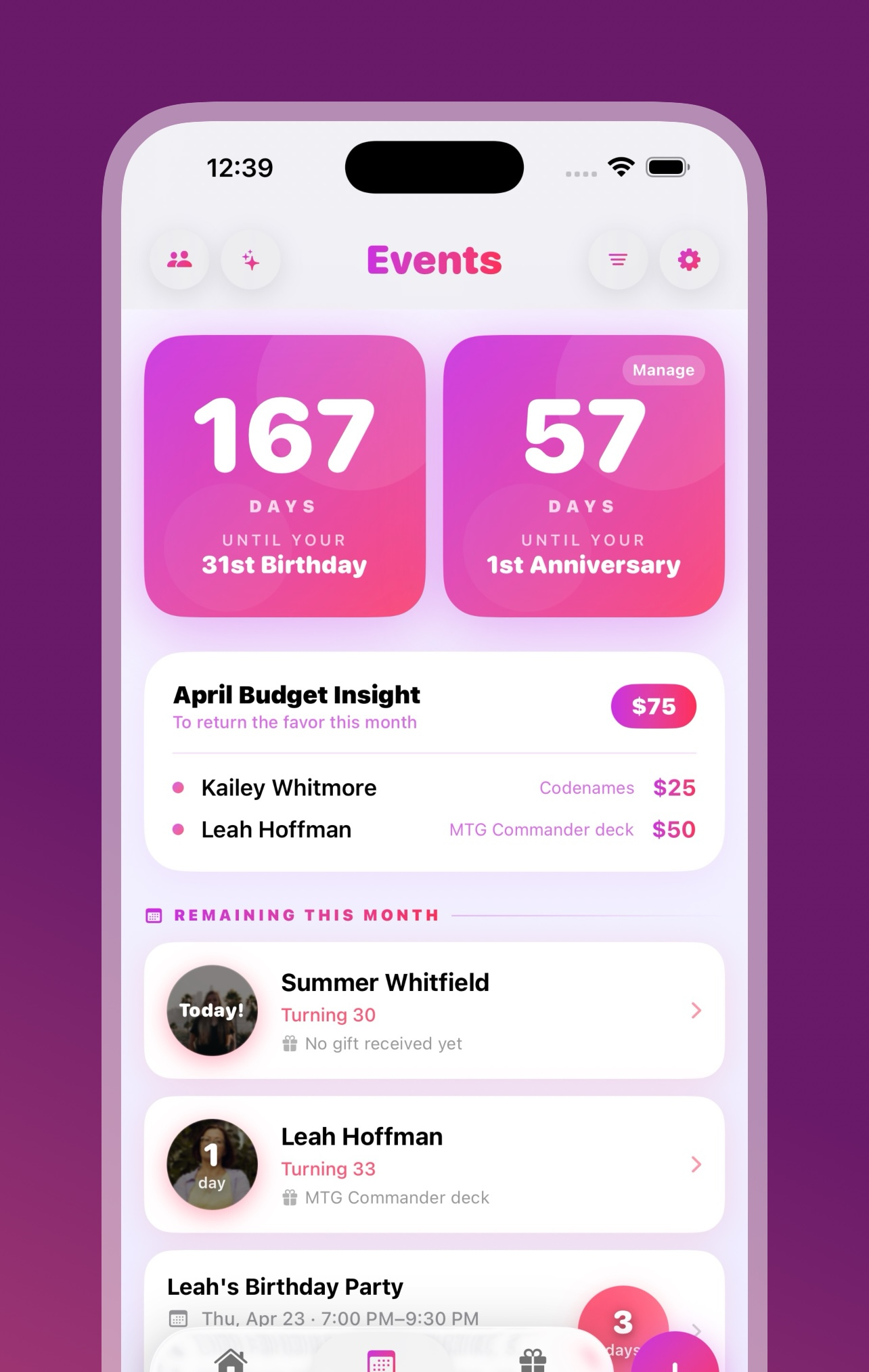
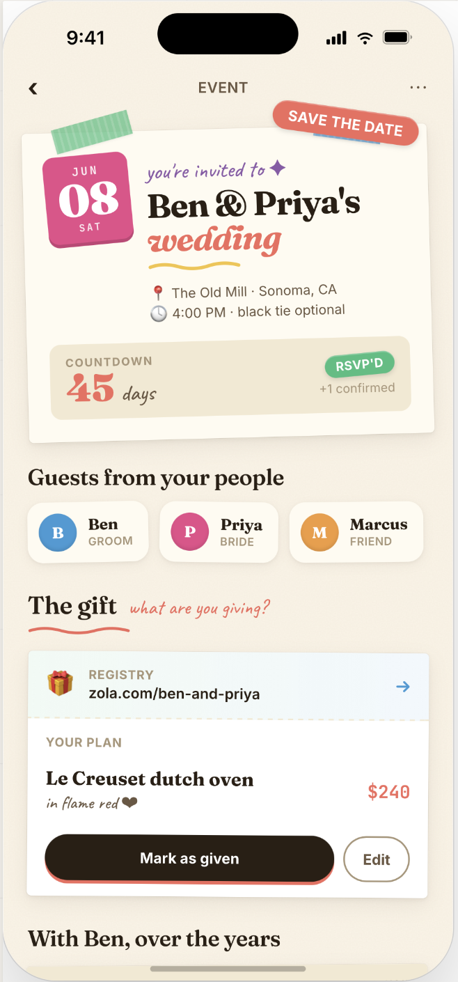
Two smaller calls in the same window. The Anniversary tab became Events once weddings, baby showers, and work milestones started showing up in test data and clearly didn't all fit under one label. Two features were cut before launch: a share button that depended on an App Store link the app didn't have yet, and a Reset All Data button that fought with iCloud sync (every time it deleted records, sync pushed them right back).
Before, and after
The screenshot shows the app the night before the day-five conversation. Three parallel tabs (Birthdays, Events, Holiday) and no landing surface. There was no single place that answered “what's coming up next” without picking a tab first.
The Home tab that replaced this layout was built that same night, and the version that shipped to the App Store three weeks later was nearly identical to that first build. The decision to make Home the primary landing surface held through every release after.
The feature set grew beyond the original spec by launch, but it stayed inside the original premise. Anything I added had to make the app less work to use, otherwise it didn't make the cut.
Three weeks later, this is what shipped to the App Store.
Key product decisions
Five decisions from the build worth talking about in detail. The first four are from v1: how I scoped accessibility, why advance reminders cap at 14 days, the privacy-by-default tradeoff, and a half-day refactor that fixed an entire family of date-corruption bugs. The fifth is from v1.2: the snapshot architecture that keeps Home Screen widgets from talking to CloudKit directly.
Accessibility shipped with v1
Accessibility was a hard requirement for v1: VoiceOver labels on every interactive element, Dynamic Type across all text styles, Reduce Motion support, and full ADA and EU Accessibility Act compliance. Retrofitting accessibility into a SwiftUI app after the fact is much harder than designing for it from the start, because every custom component, animation, and layout choice has to account for it. Doing it from the beginning was a lot less work than retrofitting it later would have been.
Capping advance reminders at 14 days
iOS only lets an app schedule 64 local notifications at a time. With dozens of birthdays, anniversaries, and holidays in a typical user's data, allowing 90-day advance reminders would push past that limit easily. The system would silently drop the overflow, and the user would never know which reminders the app had quietly given up on. To stay inside the budget, advance reminders cap at 14 days, and the rest of the notification capacity goes to a single daily digest. Users lose the ability to schedule a 30-day reminder for a wedding. In exchange, the reminders the app does promise are reminders iOS actually fires.
Why there are no servers
The app is CloudKit-only and has been since the first commit. There's no backend server, no user accounts, and no analytics or tracking of any kind. User data lives in iCloud and the app never sends it anywhere else. The trade-off is real: without analytics I can't see what features users actually use, without accounts I can't bring the product to Android later, and without a backend I can't debug a user's issue without the user reading me their own state. The upside is that the privacy promise actually holds, because the app can't leak data it doesn't have.
Half a day of refactoring to fix a date-corruption bug
Late in the build, I noticed the app was rewriting the dates users had entered. A birthday saved as 2023 would show up as 2027 after a sync. The cause turned out to be a cleanup routine: when an event passed, the routine moved it out of the active list by overwriting its date, instead of leaving the date alone and flagging the event as archived. The shortcut would have been to patch that one function. Instead I locked event dates everywhere. Once a date was saved, no code path in the app could change it. Archive status moved to a separate flag. About half a day of refactoring across seventeen files, no user-visible change, and the entire family of date-corruption bugs went away. If the app silently changes the dates users entered, nothing else about it really matters.
Snapshot architecture for the v1.2 widgetsv1.2 NEW
Widgets run in a separate process with strict time budgets. In v1.2, when I tried having widgets read directly from the CloudKit-backed SwiftData store, it didn't work. Cold starts hit the iOS time limit before anything could render, and CloudKit retry storms could take widgets down even when the main app was running fine.
The architecture I shipped moves widget data behind a snapshot boundary. The main app owns the SwiftData and CloudKit code. Whenever data changes (on launch, after a notification reschedule, or after any user action that edits something), the main app writes a JSON snapshot to a shared App Group container. The widgets only read that snapshot.
That gets me two things at once. The widget rendering surface becomes a versioned data contract the main app controls, so I can change underlying schema without breaking shipped widget code. And widgets stop crashing on CloudKit issues, because widgets no longer talk to CloudKit at all.
How it got built
I built Return the Favor with AI coding agents because that was the team I could afford to have. None of the product-management work changed because of it. The job was still defining what good looks like, breaking the work into pieces small enough to actually review, catching the moments when implementation drifted from the original intent, and calling for cuts or redesigns when they needed to happen. Those skills apply whether the people doing the implementation are humans, AI agents, or some mix.
AI agents handle the parts where the answer is patterned: boilerplate, repetitive edits across many files, sticking to a convention once it's set. They get into trouble on architectural calls and platform edge cases, and on bugs that only make sense once you're holding two or three systems in your head at the same time. My job was the parts they couldn't do for themselves: the architectural calls, the acceptance criteria, the review of what came back, and stepping in when an agent got stuck.
A small example. An agent kept producing code for a UI effect that compiled but rendered wrong. After several rounds, I read the code myself and saw it was using a SwiftUI API that only existed in iOS 18, while the project was targeting iOS 17. Bumping the deployment target fixed it in one line. The agent had no way to spot the version mismatch on its own, because it had no idea what the project was targeting in the first place.
Launch and what’s next
Return the Favor shipped to the App Store on April 23, 2026, on the original 21-day timeline. At launch the app had full WCAG and EU Accessibility Act compliance, zero P0 bugs in the first week, and a 1.1 release candidate already scoped from real-user feedback collected in the first 72 hours.
User metrics are deliberately thin. The app ships without analytics, behavioral tracking, or telemetry of any kind. That choice follows from the privacy decision in Section three, and it gets reinforced every time I watch a non-technical user pause before granting an app permission to their contacts or calendar. The cost of that posture is that I can't measure install-to-first-event conversion, retention curves, or feature adoption. The privacy promise, on the other hand, is real in a way it usually isn't, because the app has no mechanism to watch users in the first place.
What I do work from is direct feedback from the small group of people I know are using it. That's what shaped both v1.1 and v1.2, which shipped in the two weeks after launch.
Release history
Three releases shipped to the App Store between April 23 and May 5, 2026, on a cadence I'd planned out before launch. v1 was the core product. v1.1 cleaned up debt I knew I was carrying into launch. v1.2 added the platform integration (Home Screen widgets) I'd held back from v1 because the build budget didn't reach it.
First App Store release. Core gift tracking, CloudKit sync, contacts import, and full accessibility, shipped on the original 21-day timeline.
Fixed the CloudKit photo schema, cleaned up the photo data, finally added the share button I'd cut from v1, and did a pass on logging levels to quiet down the console without losing diagnostic signal. Shipped eight days after v1.
Eleven Home Screen widgets and six color palettes, plus a Match App option that picks up the user's in-app theme. The snapshot architecture from Section three, deep-link routing from widgets back into the app, a Me/Self consolidation in the data model, a state picker, and one last polish pass over typography and spacing. Shipped twelve days after v1.
Paper Party, exploratory direction
Paper Party is an Option B side project. It's a complete visual rebuild on top of the same data layer. The current app looks like a polished iOS utility; Paper Party reskins it as an editorial scrapbook, with cream paper backgrounds, a mix of serif and script typography, polaroid frames, and hand-drawn accents. The underlying app would stay exactly as it is, only the surface would change.
It isn't on the formal roadmap. I plan to build it on my own time, after I land my next role.
What I would do differently
Four things I'd do differently on the next project. None of them would have changed the v1 ship date, but each would have saved me hours of rework.
Listen earlier. The Home tab only exists because my wife asked the question I should have been asking myself. The v1 navigation was internally consistent and made perfect sense to me. It didn't match how a real user wanted to use the product. Next time, the prototype goes in front of someone outside the build earlier. When they get confused, the confusion is the answer. The fix isn't to explain the design better. It's to change it.
Validate sync on day one. CloudKit sync issues didn't show up until late in the build. By the time I noticed them, I'd already built code around sync behavior I'd assumed was working. A two-device test setup running from the first commit would have caught the problems early enough that the surrounding code would have been written right the first time.
Justify architectural choices in writing before any code gets built. AI agents propose patterns that look familiar from their training data. Those aren't always the patterns the project actually needs. Early in the build I accepted several of these without much scrutiny, and a few of them I had to undo later when their assumptions turned out to be wrong. Going forward, I write a short rationale for every architectural choice before I hand it to an agent to implement.
Verification beats trust. In v1.2, three separate times, an AI agent told me work was done when it wasn't. One was a snapshot expansion that was committed but had a diff that didn't match the description in chat. Another was a commit the agent described in detail but had never actually made. The third was a piece of widget bundling work that was claimed done but had never been wired into the app. Each time, the cost of taking the agent at its word was much higher than the cost of just looking would have been. The rule I follow now is non-negotiable: every time an agent says something is done, I check it. git status to see what's actually staged, git log to confirm the commit exists, and a full read of the diff. What the agent reports is what it claims to have done. The diff is what it actually did.
Return the Favor started from a hunch: that for most people, the missing piece here isn't better memory but a tool that makes thoughtful gift-giving easier to keep up with. v1 was the test of that hunch. I built it solo in three weeks, with AI agents writing most of the code and me handling product, architecture, and review. It shipped on the original schedule, with full accessibility, no servers, and no analytics. The next thing I work on will be bigger than this one. I don't expect to work on it very differently. I'll just have a much better idea of which mistakes to skip the second time around.